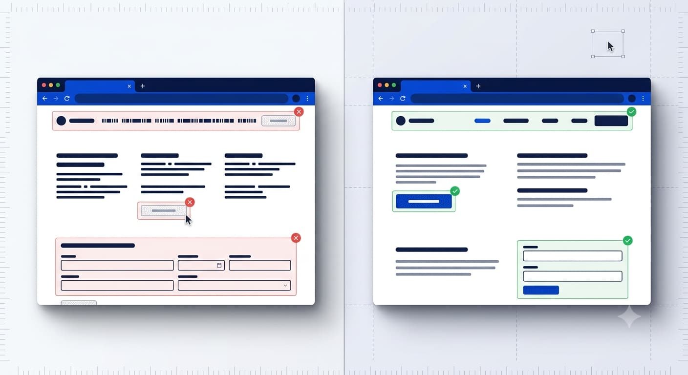
UI/UX design mistakes losing customers 2026 are more common than most business owners realize, and the cost is rarely obvious until the sales numbers drop. A recent industry benchmark found that up to 88% of online visitors are less likely to return to a site after a poor first experience. If your website feels slow, confusing, or outdated, your visitors are not sticking around to tell you why.
Let’s explore the ten UX mistakes we see most often when auditing US business websites, and how to fix each one before it costs you another customer.
Why UI/UX Design Mistakes Losing Customers 2026 Deserve Your Attention
Your website is often the first real interaction a customer has with your business. A single confusing checkout flow or an unreadable font can undo months of marketing spend.
Here’s a pro tip: treat your website like a storefront, not a brochure. Every click, scroll, and tap is a decision point where a visitor either moves closer to buying or walks away.
According to Capslock Agency’s project data, businesses that fix even three major UX issues on their site see an average 20-35% improvement in form completion rates within 90 days.
1. Slow Load Times That Kill First Impressions
Nothing drives a visitor away faster than a page that takes forever to load. Mobile users especially will abandon a site within seconds if it feels sluggish.
Google’s own research on Core Web Vitals shows that page speed directly influences both user retention and search rankings. Compressing images, minimizing scripts, and choosing reliable hosting are the fastest wins here. Fixing this alone resolves one of the most common UI/UX design mistakes losing customers 2026 across US business websites.
2. Confusing Navigation Menus
If a visitor cannot find what they need within a few clicks, they assume your business cannot help them either. Overloaded menus with too many categories create decision fatigue.
Stick to a simple structure with clear labels. Group related pages together and avoid industry jargon that your average customer will not recognize. Confusing navigation remains one of the clearest UI/UX design mistakes losing customers 2026 that we flag in almost every audit.
3. Tiny or Unclear Call-to-Action Buttons
Your CTA button is where the conversion actually happens, yet it’s often the most neglected part of a page. Low contrast colors and vague text like “Submit” leave visitors unsure of what happens next.
Use action-driven language such as “Get Your Free Quote” or “Book a Call,” and make sure the button stands out visually from everything around it. Weak calls to action are a textbook example of UI/UX design mistakes losing customers 2026 in real time.
4. Mobile Experiences That Feel Like an Afterthought
More than half of US web traffic now comes from mobile devices. A site that was designed for desktop and simply shrunk down usually breaks in ways that frustrate mobile users.
Buttons that are too small to tap, text that requires zooming, and pop-ups that cover the entire screen are some of the most common bad UX design problems USA businesses run into on mobile. These mobile gaps sit at the top of the list when we catalog UI/UX design mistakes losing customers 2026.
| Mobile UX Issue | Impact on Visitors | Quick Fix |
|---|---|---|
| Tiny tap targets | Missed clicks, frustration | Minimum 44x44px buttons |
| Intrusive pop-ups | Immediate exit | Delay pop-ups or remove on mobile |
| Unresponsive layout | Broken visuals, distrust | Mobile-first responsive design |
| Slow mobile load speed | High bounce rate | Image compression, lazy loading |
5. Cluttered Homepages With No Clear Message
When every section is fighting for attention, none of them win. Visitors need to understand what you do and why it matters within a few seconds of landing on your homepage.
Cut anything that does not directly support your main message. White space is not wasted space; it gives your key content room to breathe. A cluttered homepage is often the first of many UI/UX design mistakes losing customers 2026 that visitors notice within seconds.
6. Forms That Ask for Too Much, Too Soon
Long forms feel like a demand, not an invitation. Every extra field you add is another reason for a visitor to close the tab.
Ask only for what you need at that stage. A simple name, email, and one qualifying question will convert far better than a ten-field intake form on a first visit. Overloaded forms are a quiet but costly driver of UI/UX design mistakes losing customers 2026.
7. Inconsistent Branding and Visual Design
Mismatched fonts, clashing colors, and inconsistent button styles make a business look unfinished, even if the product is solid. Visitors read visual inconsistency as a signal of low trust.
A consistent design system across every page reassures visitors that they are dealing with a legitimate, established business. Inconsistent branding is another of the recurring UI/UX design mistakes losing customers 2026 we see during audits.
8. Poor Color Contrast and Accessibility Gaps
Light gray text on a white background might look sleek in a mockup, but it’s unreadable for a large share of real visitors. Accessibility issues also expose US businesses to legal risk under ADA-related web standards.
The Nielsen Norman Group has documented how poor contrast disproportionately affects older users and anyone browsing in bright sunlight. Fixing contrast is one of the cheapest, highest-impact UX changes available.
9. No Clear Path to Conversion
A beautifully designed page that never asks the visitor to do anything is a missed opportunity. Every page should have one clear next step, whether that’s booking a call, requesting a quote, or making a purchase.
If a visitor has to hunt for how to contact you, they will simply leave and choose a competitor instead.
10. Ignoring Real User Feedback and Testing
Many businesses design a site once and never revisit it, even as customer behavior changes. Skipping user testing means you are guessing at what works instead of knowing.
Simple tools like heatmaps, session recordings, and short user surveys reveal exactly where visitors get stuck. This is one of the fastest ways to fix website UX design USA companies often overlook until traffic starts dropping.
How to Fix Website UX Design USA Businesses Rely On
Fixing UX issues does not require a full rebuild. Most of the mistakes above can be addressed with focused, prioritized changes over a few weeks.
The Capslock team recommends starting with mobile experience, page speed, and call-to-action clarity first, since these three areas typically produce the fastest measurable lift in conversions.
You can learn more about how a structured redesign process works on our UI/UX Design services page. If your site also needs a technical foundation rebuild, our web development services cover that end to end.
For related reading, take a look at our posts on building a website that ranks in Google and AI search and the top signs your business needs a new website in 2026.
Conclusion
UI/UX design mistakes losing customers 2026 are fixable, but only once you know exactly where they are hiding on your site. Small, focused changes to speed, navigation, mobile experience, and clarity often produce results within weeks, not months.
The Capslock Agency team has audited hundreds of US business websites, and the same patterns keep showing up across industries. Fixing them is rarely about a full redesign; it’s about removing friction one screen at a time.
FAQ: UI/UX Design Mistakes Losing Customers 2026
How do I know if my website has UX problems?
High bounce rates, low time on page, and abandoned forms are common signs. A quick UX audit can pinpoint exactly where visitors are dropping off.
What is the fastest UX fix for a small business website?
Improving page load speed and making your call-to-action buttons more visible usually deliver the quickest measurable improvement.
Do UX mistakes affect SEO too?
Yes. Google’s Core Web Vitals directly factor page speed and mobile usability into search rankings, so UX and SEO are closely linked.
How often should a business review its website UX?
A full UX review every 12-18 months is a reasonable baseline, with smaller checks whenever traffic or conversion patterns shift.
Can fixing UX issues really increase sales?
Yes. Reducing friction in navigation, forms, and mobile experience consistently improves conversion rates across most industries we have worked with.
Ready to Fix Your Website’s UX Before It Costs You More Customers?
Capslock Agency helps US businesses identify and fix the exact UX issues driving visitors away. We combine hands-on design experience with real user data to prioritize the changes that matter most.
Our UI/UX Design services include:
- Full UX audits and heatmap analysis
- Mobile-first responsive redesign
- Conversion-focused landing page design
- Accessibility and contrast compliance
- Wireframing and prototyping
- Ongoing usability testing and optimization
We work with small businesses, startups, and established enterprises across the US looking to turn their website into a real sales tool.
Book a free consultation — let’s find out exactly what’s costing you customers on your site.
📧 hi@capslockagency.com | 🌐 capslockagency.com | WhatsApp | 📞 US: +1 530 819 7542